What Hick's law says, and where it came from
Hick's law is the finding that the more equally likely options a person faces, the longer they take to pick one. In the early 1950s, Hick and then Hyman ran reaction-time experiments in the lab and found that the time to respond rose with the logarithm of the number of choices. Psychologists now call it the Hick-Hyman law.
The logarithm is the useful part. Time does not double when options double; each doubling adds about the same extra step. Going from two choices to four costs roughly as much as going from eight to sixteen. For a website, that means a couple of extra menu items are unlikely to be the problem on their own, while a long, flat list of similar items can slow down everyone who lands on it.
A rule of thumb, not a precise prediction
Hick's experiments measured simple responses, where every option was equally likely and the person knew exactly what each one meant. Someone visiting your site is rarely in that position. They scan, skip, spot familiar words such as Contact or Pricing, and ignore whole sections they do not care about. You cannot plug your menu into the formula and predict an enquiry rate.
What carries over is the direction of the effect. When options look alike and a visitor has to read and compare each one, more of them means more effort before anything happens. When one option plainly matches what they came for, the length of the list matters much less. The job is to make the right option easy to recognize, not only to make the list short.
Choice overload: the jam study and what came after
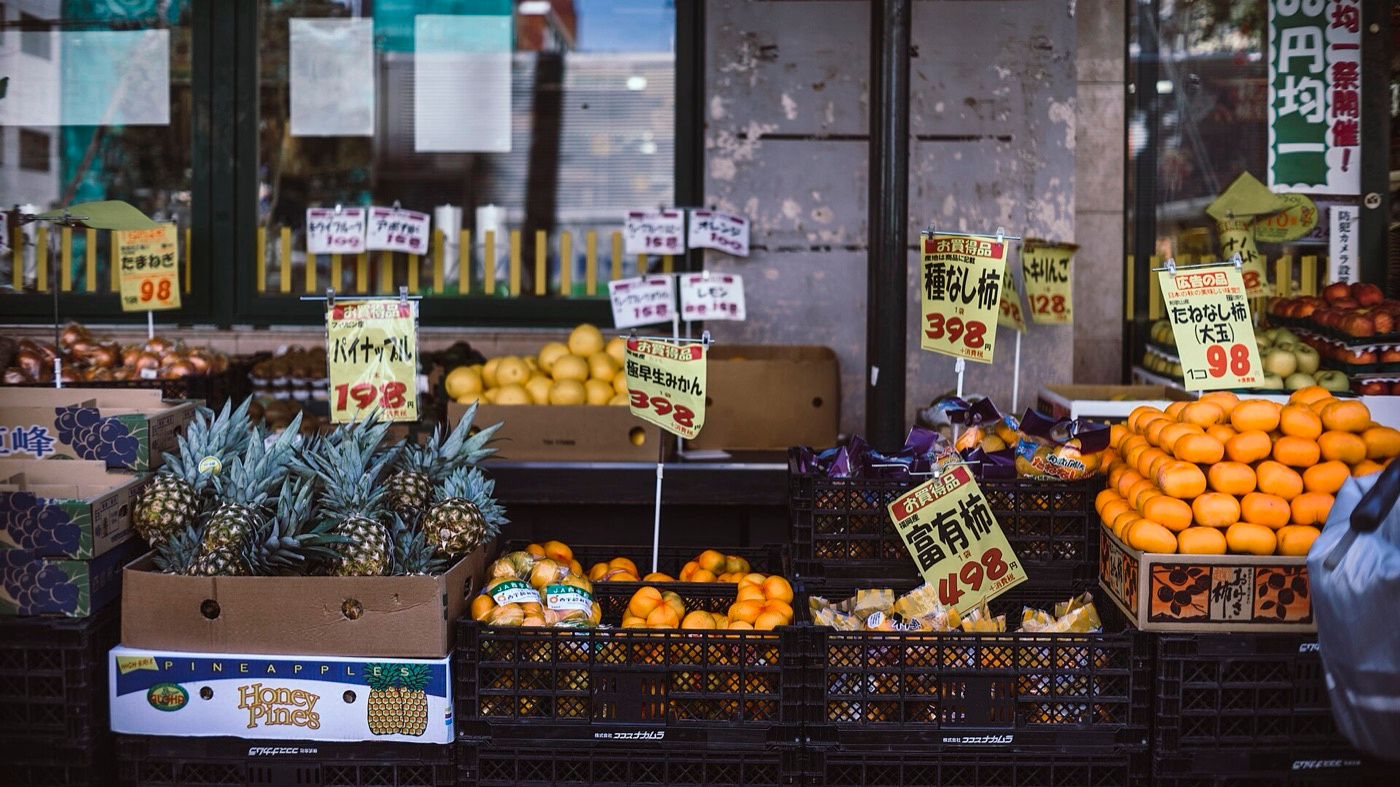
The famous evidence for offering less comes from a grocery tasting stand studied by Iyengar and Lepper. A display of 24 jams drew more shoppers to stop than a display of 6. Yet about 30 per cent of the people who saw 6 jams bought a jar, against about 3 per cent of those who saw 24. The bigger range won attention and lost sales.
Then the picture got more complicated. A later meta-analysis by Scheibehenne, Greifeneder and Todd pooled many choice-overload studies and found an average effect close to zero. Overload shows up under some conditions, such as when people have no clear preference or the options are hard to compare, and not under others. So drop the idea that fewer is always better and ask a narrower question.
Are your visitors unsure what they need, and are your options hard to tell apart? For many service businesses, both are true on a first visit. Someone booking their first physio session or getting a roof inspected often cannot judge between five similar packages, which is exactly where trimming and grouping pay off.
Where too many choices hide on a small business website
Choices pile up in places owners stop noticing. The main menu gains a link each time a new service launches. The homepage hero carries three buttons of equal weight. A services page lists fourteen offers in identical cards. A contact form makes people pick an enquiry type from a long dropdown before saying anything at all.
Each of these asks a visitor to compare things they do not yet understand. Packages are a common case: three tiers with clear differences are easy to weigh, while five tiers separated by small feature changes invite a long comparison, and some people will leave to think about it. Choosing a web design company that plans the site structure before the visuals helps stop this sprawl early.
Where simplifying backfires, and what to try on your own site
Fewer options is not automatically better. Hide a service people are actively looking for and they may assume you do not offer it. Bury the phone number to push visitors toward a form and some callers will go elsewhere. Squeeze a menu into three vague labels such as Solutions and Resources and you swap a quick choice for a guessing game, which is slower still.
Aim for a short, obvious path for the common case and a clear exit for everyone else. Measure before and after each change: menu clicks, form starts and finished enquiries. Our conversion rate calculator turns those counts into rates, the growth check shows where in the journey you lose people, and our guide to conversion rate optimization covers the wider testing process.
- Count the items in your main menu and group related services under a few plain labels
- Keep one primary button per screen and turn the others into quieter text links
- Remove enquiry-type dropdowns and any form field you do not need in order to reply
- Offer only as many packages as you can explain in one sentence each
- Add a Not sure? Book a short call option for undecided visitors
- Check which menu links get almost no clicks in GA4 and test grouping or removing them
Fewer visible choices as AI does more of the choosing
Search engines and AI assistants increasingly narrow the options before a visitor reaches your site, and some sites already tailor menus and offers to what each visitor has shown interest in. That moves the work from cutting choices to labelling them well, so that a person or an assistant can tell your services apart and pick the right one.
- 01Plain, specific service names are likely to matter more than clever ones
- 02Personalized menus may show returning visitors fewer, more relevant options
- 03Chat and voice interfaces push businesses to offer one clear next step
Questions & answers
It is the finding that people take longer to decide as the number of equally likely options grows, although the delay rises more slowly than the list does. It comes from reaction-time experiments by Hick and Hyman. On a website, treat it as a reminder to cut, group and order choices rather than as an exact formula.
No research supplies a magic number, and Hick's law does not either. A handful of plain top-level labels, with related services grouped beneath them, usually suits a small business site. Look at your analytics: links almost nobody uses are candidates for grouping, while pages people search for must stay easy to find.
Sometimes. Iyengar and Lepper's jam display turned far fewer browsers into buyers when it held more flavours, but a later meta-analysis put the average effect across studies near zero. Overload tends to appear when people lack clear preferences or cannot easily compare options, which describes many first-time buyers of a service.
No. A single option removes comparison altogether and can send people off to compare you with other businesses instead. Two or three clearly different packages are usually easy to weigh up. Name each one for the customer it suits and state the main difference between them in a single line.