What Hick and Hyman actually found
In the early 1950s, two researchers named Hick and Hyman timed people as they responded to lights, with more or fewer possible signals. They noticed that the time to respond rose with the logarithm of the number of equally likely options. In plain words, each extra option costs a little less thinking time than the one before it, but the cost never drops to zero. It is a common starting point in marketing psychology for that reason.
That finding came from simple reaction tasks, not from websites. Treat it as a useful rule of thumb about attention, not a formula that predicts how long a visitor will hover over your navigation bar. The direction is sound. The exact numbers do not carry over to a menu. A neighbouring idea, the Von Restorff effect, covers how a single item that looks different gets noticed.
The jam table and its second act
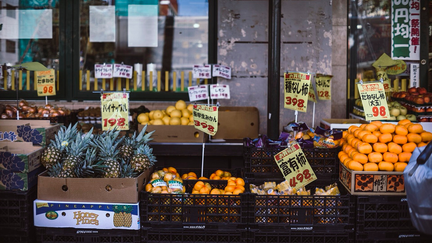
Around the turn of the century, Iyengar and Lepper set up a tasting stand in a grocery store. More shoppers paused at the table when 24 jams were out than when only 6 were. But among the people who stopped, about ten times as large a share of those who faced the 6 went on to buy a jar. The story spread through every marketing deck for twenty years.
Then came the second act. Scheibehenne, Greifeneder and Todd later pulled together many choice studies and found the average effect close to zero. Large ranges sometimes overwhelm people and sometimes delight them. Overload shows up when shoppers do not yet know what they want, or when the options are hard to tell apart. A tidy, familiar range of 24 can work fine. Treat any dramatic claim, in neuromarketing or elsewhere, with the same caution.
A heating company's service page, before and after
Say a Langley heating and cooling company's website design lists fourteen services in a single scrolling grid, from furnace repair to duct cleaning to heat pump installs. A homeowner with a dead furnace in January has one question: can these people come today? The grid makes that visitor read a dozen lines of work they do not need.
A calmer layout leads with three doors: something is broken, I want a quote on new equipment, and I want a regular tune-up. Each door opens to a short list. Nothing was removed from the business. The page simply sorts the choices so the reader meets three at a time, and the urgent visitor reaches the phone number first. The same three doors suit a Google Ads landing page, where the visitor clicked with one urgent need.
Forms, packages and the booking button
Forms are where Hick's law quietly costs the most. Every extra dropdown is a small decision. A Mission physiotherapy clinic that asks for the injury type, preferred therapist, time window, insurance provider and referral source before the visitor can book has built a quiz. Ask for a name, a phone number and one preferred time, and collect the rest on the first call. Shortening forms is a standard job in conversion rate optimization for that reason.
Packages follow the same logic. A price page with seven tiers invites people to leave and think about it. Three clear options, each described in one line about who it suits, lets a visitor find themselves quickly. If your work truly varies, use a short question to route people to the right option instead of showing every option at once. Pricing psychology has more on wording tiers honestly.
When more choice is the honest answer
Do not strip a site bare in the name of a psychology effect. A nursery near Chilliwack with hundreds of plants should show hundreds of plants. What helps is structure: filters, sensible categories, a short list of popular picks at the top. Shoppers who know what they want will happily browse a deep catalogue. The growth check can show whether a leak is on the menu or somewhere earlier in the journey.
The risk lives in the middle, where a visitor is unsure and the choices look alike. That is where grouping and plain labels earn their keep. Test any change, because a cleaner page is a hypothesis, not a result. The conversion rate calculator can help you turn your before and after numbers into something you can compare.
- Cut your main navigation to the handful of pages visitors use most, and move the rest to the footer
- Sort a long service list into three or four plain-language groups with short headings
- Remove every form field you do not need for the first reply
- Write one line under each package saying who it suits
- Compare enquiries for four weeks before and after, using the growth check to spot where visitors drop away
Choice in a world of search assistants
By 2027 many visitors will arrive already narrowed down by a search assistant that has summarised their options. That raises the bar for your own page. If the assistant sends someone to you, they expect to find the answer fast. A site that presents a handful of clear paths will feel like a continuation of that experience, not a fresh sorting job.
- 01Make each page answer one clear question
- 02Name your offers the way customers describe them
- 03Review your menus whenever you add a service
Questions & answers
It says that the more equally likely options you place in front of someone, the longer they take to decide. The time grows steadily but with diminishing steps. It was measured in simple reaction tests, so use it as a guide to attention rather than a precise prediction.
Not on its own. It showed a striking gap at one tasting stand, but later reviews of many studies found the average overload effect close to zero. It tends to appear when preferences are unclear or options are hard to compare, so test your own audience.
There is no magic number. Three packages and a handful of main menu items are a sensible starting point for most local firms. A large catalogue is fine if it has good filters and categories. Let your own enquiry numbers settle it.
Change one thing, such as a shorter form or a tidier service list, and compare enquiries over a few weeks of similar traffic. Note seasonal swings, which are strong in the valley. Conversion rate optimization work formalises this with proper split tests.